There's a high probability you're working on a product that's going to be used on a mobile phone. And if you're not, you probably soon will be.
A lot of us are building mobile apps these days and that means we're sampling each other's products pretty heavily. Right now, I've got a folder full of ~200 apps that I've downloaded for research. There have been many times I wish I could have jumped inside the product designer's head to see what they learned during the experience of building these apps.
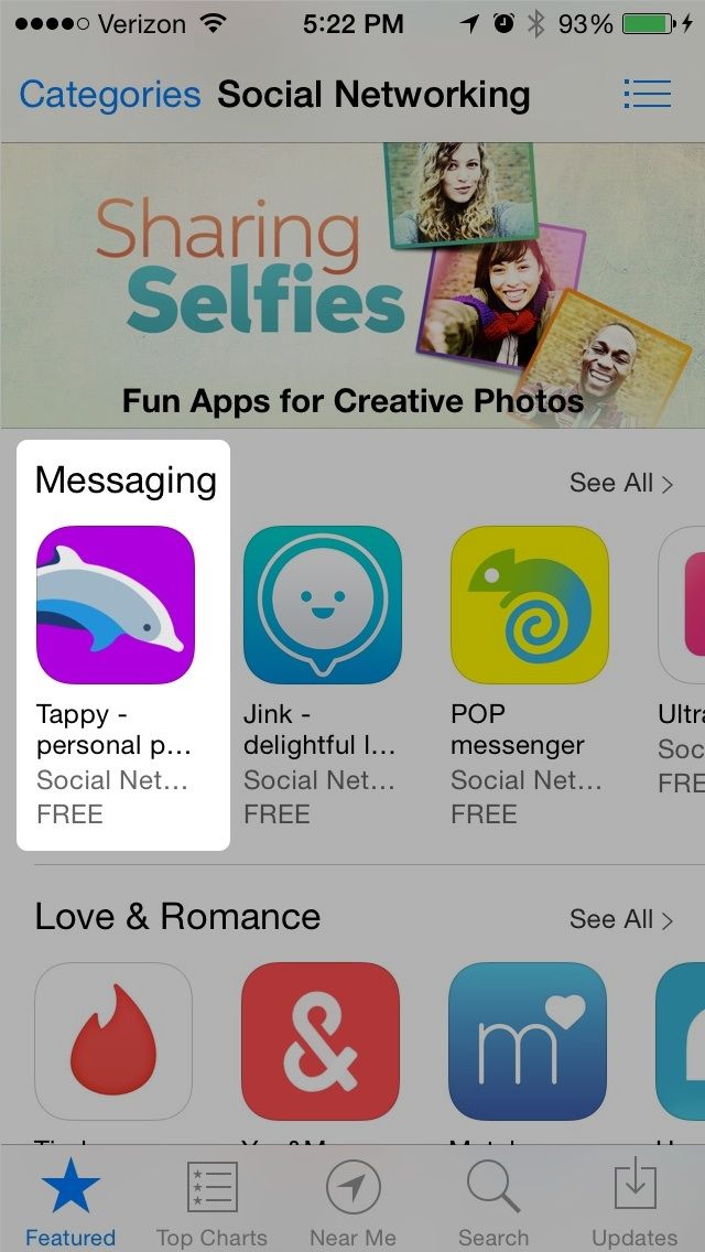
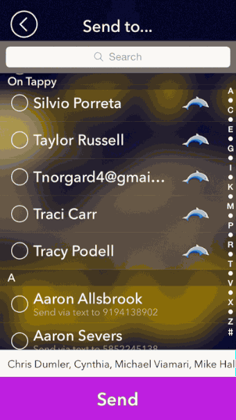
It just so happens that I'm coming up for air after building an iOS app from scratch. Called Tappy, a team of six colleagues and I spent nine months building it. The app went live a couple of weeks ago and has been featured in the App Store. (Download it here if you want to see it fully in action).
(You can download Tappy on the App Store).
I've tried dissect what a lot of other apps do well, but haven't really described my own decisions. So in the spirit of be the change you wish to see in the world , I thought I'd share what I learned on the journey from idea to getting featured in the App Store.

I'll show you some big design decisions that were made, and I'll try and convey it under the banner of something broader I learned. There are lots of animated GIFs (of course) and, I hope, actionable takeaways.
A quick caveat: even though a lot of our friends seem to like the app, Tappy isn't an overnight success. Do I hope it will be? Yes. Is it right now? No. My only goal here is to illuminate part of the process by which Tappy was built — and to highlight some takeaways I wish I had access to when I started working on this project.
Prototyping really works.
I was a prototyping skeptic before I became its biggest convert (even going so far as to create a Quartz Composer prototyping crash course for designers). Especially powerful for mobile applications, prototyping allowed me to experiment quickly with transitions, animation timing, physics, and taps.
Prototyping lets you work out the kinks in your thinking before ever bringing it to an engineer. And it opens up a creative feedback loop when you're able to work in the medium for which you're designing. Because of this, prototyping made me a better designer.
I began realizing that my biggest design breakthroughs happened when I prototyped in Quartz Composer. It's certainly not the world's most intuitive prototyping app (I'm eyeing up Pixate as we speak). But the payoff tied to each team member getting to play with a prototype, give feedback, and be able to play with an updated prototype within minutes vastly sped up parts of our design process. It became essential.
Even cooler, I was able to provide details like timing details, pixel offsets and ready-sliced art when we decided it was time to implement a prototype — because they already existed. It also brought me closer to the engineering process, helping me better understand the logic of how things would be implemented. This empowered me to make better decisions as I came up with new designs.
Want to see my prototypes in action? Check out an actual Quartz Composer composition file that I used to prototype Tappy. Note: you'll need to have Quartz Composer and Origami 1.3 installed.
Download my Quartz Composer prototype now
Investing in original, creative animations pays off.
You're so much more powerful when you can communicate animations with your own prototypes. You're no longer stuck pointing to other people's animations, saying "do it like this, but cooler!" And you're certainly no longer tied to drawing Bezier curves on paper to demonstrate how something should bounce.
As Uncle Ben from Spiderman said, "with great power comes great responsibility." Since I had a whole new interaction palette unlocked through Quartz Composer, I realized I could place as much emphasis on designing motion as I did the designing the interface itself. I believe it's now synonymous with interface design in terms of importance.
And with iOS 7's increased emphasis on movement, it's essential that every app designer take these design components seriously. It's another way to give your app an identity and expand on its personality. You don't want to look like everyone else.
So we took risks with certain animations that seem to have paid off. They took a number of revisions to get right, especially after I learned that animation timing in key interaction flows shouldn't last more than .2 seconds. Beyond that limit, the animation can become onerous and distracting.
Here are some examples:
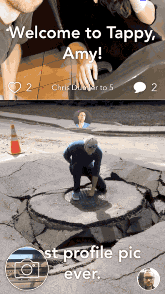
Welcome Screen
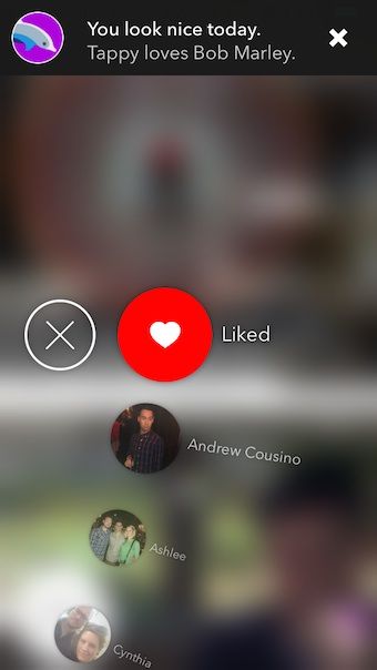
The first time you open the app, you should get a little dopamine hit. We thought it'd be great if our "mascot," Tappy the Dolphin, welcomed you.
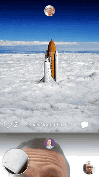
Pull to Refresh
For the pull-to-refresh animation, we wanted something that reinforced our branding but was unexpected and endearing. Who would expect a 3D dolphin to jump out at them?
Send
Sending a photo should be satisfying. When your photo completes its upload, Tappy the Dolphin makes a cameo and the metadata bounces into place.
Jelly Buttons
Every tap should also be satisfying, and should react as if you're physically "smushing" it down. I call this the "Jelly Button" effect.

Giving your app a specific voice makes copywriting and marketing easier.
You probably won't need to go as far as we did on this one, but I think every app benefits from having a universal personality and character. This can also inform your app's branding and make everything feel like a complete package.
The benefit is that choosing a tone and personality makes copy easier to write. And that's important. Copywriting is still perhaps the most powerful piece of your interface.
With Tappy, we wanted to strike a lighthearted, upbeat tone. It started with the name and went from there. We infused this into our in-app push notifications, App Store blurb, error messages, and onboarding.
But as a I mentioned earlier, we took this to the extreme and made a character out of our logo. Tappy the name became "Tappy the Dolphin," who shows up and talks to you at times.
Too far? Maybe. But it's personable and different.
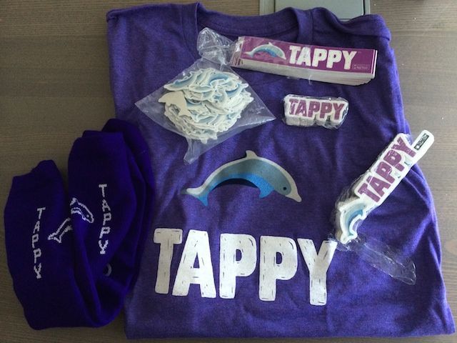
A side effect of this path was an easy decision about what types of swag we got made: socks, dolphin stickers, temporary tattoos, etc.
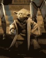
There's a fine line to walk here, and you can certainly slip into "Clippy" territory before you know it. But in the right cases and with just the right amount of creativity, your app can take on a completely fresh personality.
(This is Clippy. One does not want to resemble Clippy.)
As we developed our voice, my model was Eat24. Everything I've read of theirs has a consistent tone — email, loading screens, error messages, etc. And in many cases, I've LOL'ed.
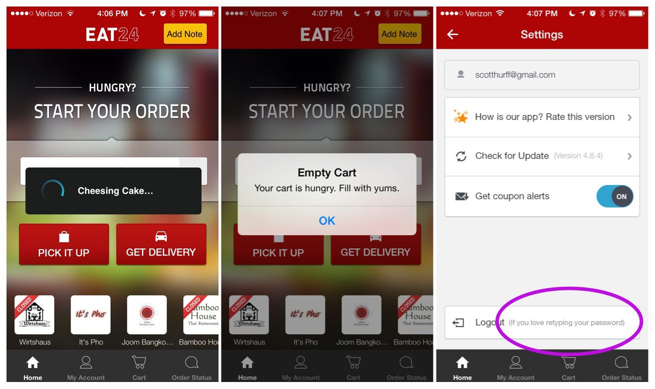
Don't miss a marketing opportunity by neglecting your App Store "What's New" copy.
Switching gears, one important element that app makers frequently miss is the power of the "What's New" text you enter when you update your app. Even with iOS 7's background app updating, people still ready your update copy, both in the "Updates" tab in the App Store, and on your app's primary download screen
And you should use it. It's your only channel to remind people what your app does (I know you're gasping at the thought that people could forget) and why they shouldn't delete it.
So don't just dump your raw, unfiltered Release Notes here. It's a great chance to ask for reviews, and to explain why they're important.
Finally, don't forget that for every release you make, your review count in search results is reset to zero. Nobody wants to download an app without visible reviews.
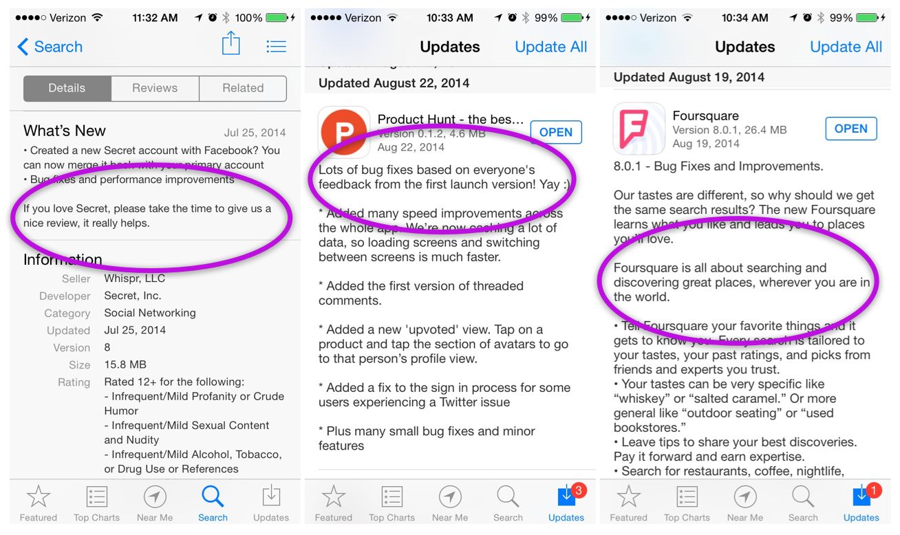
Product Hunt, Secret, and Foursquare all do great jobs on various axes in this realm. Product Hunt succeeds in making me want to read the text because it leads off with its own personality. Secret reminds me to leave a review, because "it really helps." And Foursquare reminds me what its purpose is.
Did you get value out of this?
Hopefully this helps with your current project. If you got any value out of it, I'd be grateful if you shared it. You can Tweet it now with one click.
And if you want to give Tappy a try, you can get it here for iOS.