You know that feeling even if you can’t name it — the mix of frustration and annoyance when you’re using a touch interface that you can’t quite get to work correctly. When you feel like you have to touch delicately just to trigger that command that’s right there in plain sight.
But what if you could create user interfaces on a regular basis that you knew would reasonably avoid this situation? What if you knew you could reliably create touch elements that helped your customers reduce errors, get things done faster, and ultimately be happier with your product?
It's possible. Let's explore why.
You've failed me for the last time, iOS 9
I used to run into this problem when using the music controls on the iOS 9 lock screen.

For the life of me, whenever I wanted to skip a song while on the go, I couldn’t get the button to work on the first, second, sometimes third try. I’d even end up jacking the volume up high. Other times, I might pause the song.
Ultimately, the negative experience with this interface made me change my behavior: I avoided it.
This was a terrible failure. An interface designed with the sole intention of saving me time ended up costing me a lot of wasted minutes.
Somehow, somewhere, iOS 9’s music controls broke a key law of the user interface. But which one?

Thankfully, iOS 10 came along and changed things. Bigger controls. Generous tap targets. Larger artist and song information, making it way easier to read who’s gracing my headphones.
In other words, my on-the-go song hopping error rate noticeably decreased.
Why?
Science has the answer.
Learning from 120 million taps
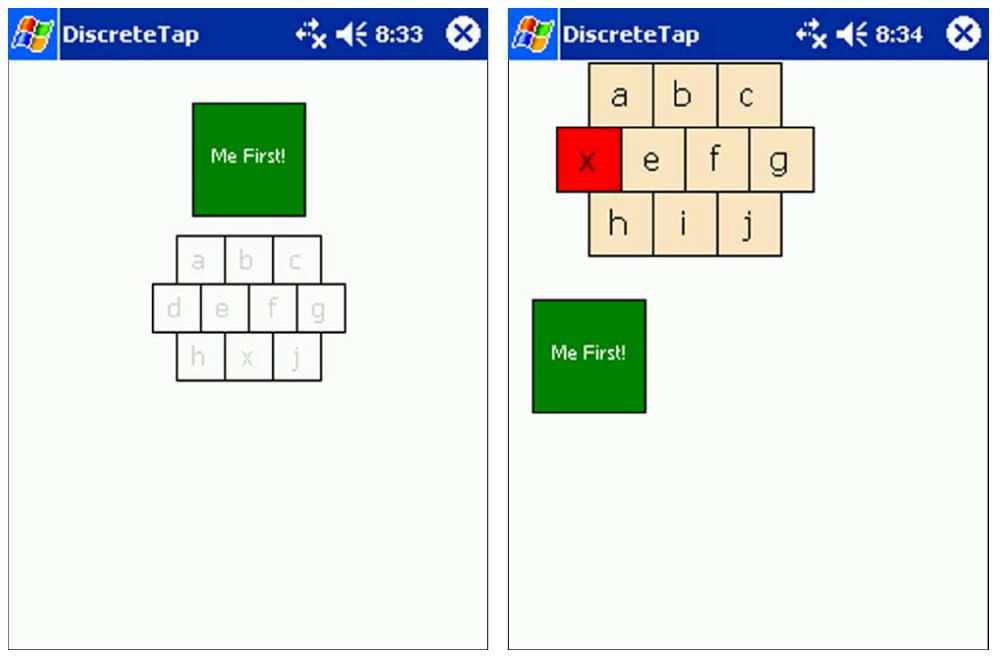
In 2006, researchers from the University of Oulu, Finland and the University of Maryland, College Park teamed up. Their goal? To determine what size buttons were easiest to use on a touch screen for one-handed use.
They tested two scenarios. The first: people performing one-time tasks (things like activating buttons, check boxes, or radio buttons). The second: people performing a sequence of tasks, like inputting a phone number.
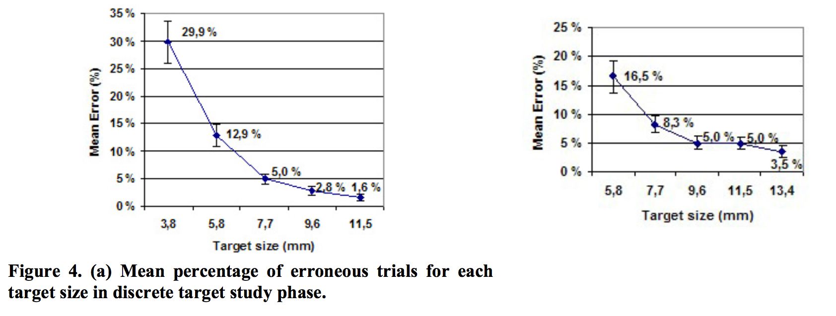
During the study, the researchers tested a range of button sizes for each scenario. They discovered that error rates increased significantly when buttons were smaller than 9.2mm for single tasks; the same happened for buttons smaller than 9.6mm for serial tasks.
Curiously, for the serial task phase, error rates held steady from 9.6mm up to 11.5mm. More on this later.
Five years later, a study was conducted by researchers from two German universities. Their goal: to determine the optimal touch target size for a touch screen button.
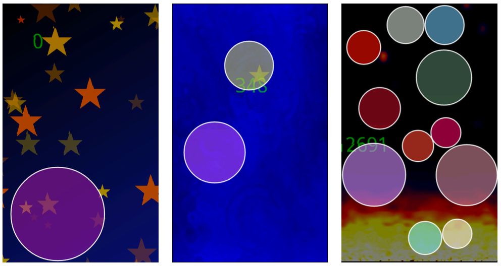
To conduct the study, the researchers released an Android game that was downloaded ~100,000 times, recording ~120M touch events. The gameplay was simple: players had to tap floating circles of various sizes to progress forward. The circles could be anywhere on the screen.
After analyzing the game’s tap events, the researchers found that for circles less than 15mm in size, gamers’ error rate steadily increased — rising sharply below ~12mm. And for tap targets less than 8mm, gamers missed the circles at rate of over 40%!
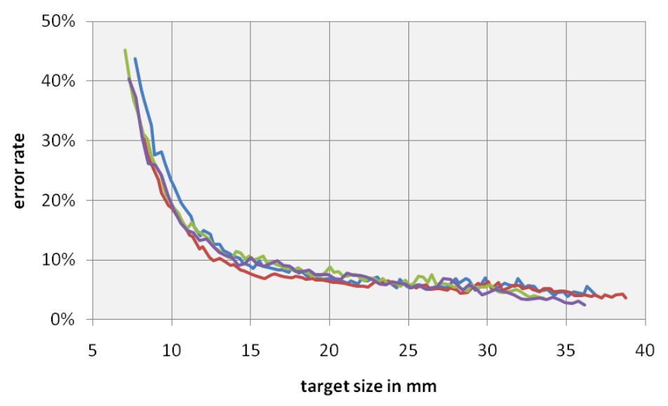
Curiously, the 2011 study also found accuracy improvements of little significance for target sizes over 12mm.
There are countless other studies I could cite, including recommended element sizes established by major vendors like Apple, Google, and Microsoft (which I’ll get into later) — but we first need to discuss the granddaddy of all of these standards: Fitts’s Law.
A time portal into history
As product designers, we’re benefiting from the hard work of our predecessors. In this instance, Paul Fitts — a psychologist at The Ohio State University (Go Bucks!) — created a principle in 1954 that would later become known as Fitts’s Law. It's since become a foundation of human-computer interaction.
At its most basic, Fitts's Law is a model for how long it takes for you to move your hand to an object. The closer the object and, roughly speaking, the larger it is, the quicker and easier it is to move your hand to it.
But Fitts was able to mathematically model this. And if applied to a touch screen interface, for example, we could determine how long it'd take for you to point your finger at something if we knew the size and distance of the objects on the screen.
Here's the actual equation:
MT = a + b log2(2A/W)
Where:
- MT = the time it takes to complete the movement
- a,b = parameters which vary with the situation
- A = distance of movement from start to target center
- W = width of the target along the axis of movement
Now, I'm no mathematician, but the research I've done on this says that the logarithmic portion of this function is really important.
Cognitive scientist and co-author of the book Mind Hacks Tom Stafford summarizes the impact of this dynamic incredibly well:
"Although the basic message is obvious (big things are easier to select) it is the precise mathematical characterisation that is exciting, and that this characterisation includes a logarithmic function – which means that the shape of relationship between size and reaction time is curved so that small increases in size for small objects result make it much easier to select them (whereas small increases in size for big objects don’t make that much difference). And the same applies for changes in target distance."
What’s exciting is that modern research continues to prove this over and over again. In the two papers I cited before, each demonstrated diminishing returns past a certain button size — somewhere along 12mm to 15mm.
But the best part? We can use this to design better user interfaces.
Here’s how.
Designing better user interfaces using Fitts’s Law
Using Fitts’s Law as a foundation — and by incorporating the studies from earlier — you can design truly tappable user interfaces almost every time.
First, let’s take the button size recommendations from the two studies above:
- 9.2 x 9.2mm
- 9.6 x 9.6mm
- 12 x 12mm
- 15 x 15mm
Next, let’s also mix in the minimum recommended guidelines from Apple, Google, and Microsoft for touch targets:
- Apple: 44 x 44 points
- Google: 48 x 48 dp + 8dp or more of space = 56 x 56 dp
- Microsoft: 9 x 9mm + 2mm of recommended padding on both sides = 13 x 13mm
Agh! How do we normalize these values?
We need to convert these millimeter measurements to pixels, and convert our device-independent pixels to points. Since pixels have, by definition, no standard measure, we need to use the following formula that takes into account the pixels per inch of a particular display.
For the sake of this discussion, let’s assume we’re using an iPhone 7 Retina display. According to Apple’s specs, the iPhone 7’s display has a PPI of 326.
So, all we need to do is drop each millimmeter suggestion into this formula:
Now, since I assume most of you work in Sketch, let’s convert our results to points. See, the iPhone 7 has a pixel density of 200%, so we simply need to divide by “2” in this situation to design correctly in 1x (Confused? Here’s a great piece by Kurt Varner {who was in my book Designing Products People Love!} about why designing in 1x makes for a more effective workflow).
Second, once we’ve converted all of these sizes, let’s compare how they would appear within the confines of an iPhone 7 display. I’ve also indicated where each major vendor’s standards appear, and key sizes mentioned in the research papers above:
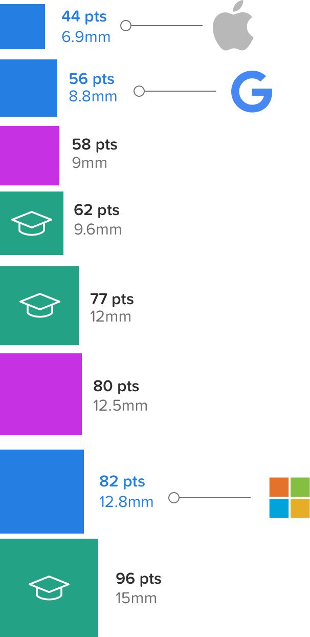
To add more fuel to the fire, I’m also curious: what were the tap target sizes for the iOS 9 and iOS 10 lock screen music controls? Would there be any overlap with any familiar sizes?

Isn't that interesting?. From iOS 9 to iOS 10, Apple expanded grew the controls from ~7mm to 12.8mm.
That's right in line with Microsoft touch guidelines!
How to make your UI truly tappable
Since the average human finger pad is 10 to 14mm — and the average fingertip is 8mm to 10mm as discovered by MIT Touch Lab — I think we can pretty easily define a range for what constitutes a “truly tappable UI:”
A truly tappable UI is built with elements that are at minimum around 10mm, with the optimum touch element size around 13mm, which is at Microsoft's standard.
Within these bounds, I think you can confidently create user interfaces that will help your customers reduce errors, get things done faster, and ultimately be happier with your product as a result.
Use My Google Sheet to Convert Millimeters to Points
Here's a link to the Google Sheet that I used to make these calculations. Please copy and use for your own uses. And please keep me apprised of any victories or errors on my part.
...and spread the love!
If you liked anything in this post, I'd be grateful if you shared. Just one click to Tweet, and you can edit before you send.