Hey! This is an excerpt from my book Designing Products People Love, which was published by O'Reilly in January 2016. Learn more about the book and the 20+ product designers from Facebook, Twitter, Slack, etc. who were interviewed about how they work.
Have you ever experienced a user interface that feels lifeless? Have you created a UI that just seems to be missing...something?
If that's the case, you've probably experienced a case of Awkward UI.
Awkward UI is a missing loading indicator. It's forgetting to tell your customer where something went wrong. Bonus points for doing so with a scary error message. It's a graph that looks weird with only a few data points. It's a linear snap into place when introducing a new piece of data.
Still not clear about what Awkward UI is? Here's a simple real world example: I use Apple TV. A lot. (In fact, I have the latest episode of Star Wars: Rebels playing in the background as I write this). Whenever I pull up my Purchased movies, I see this screen:
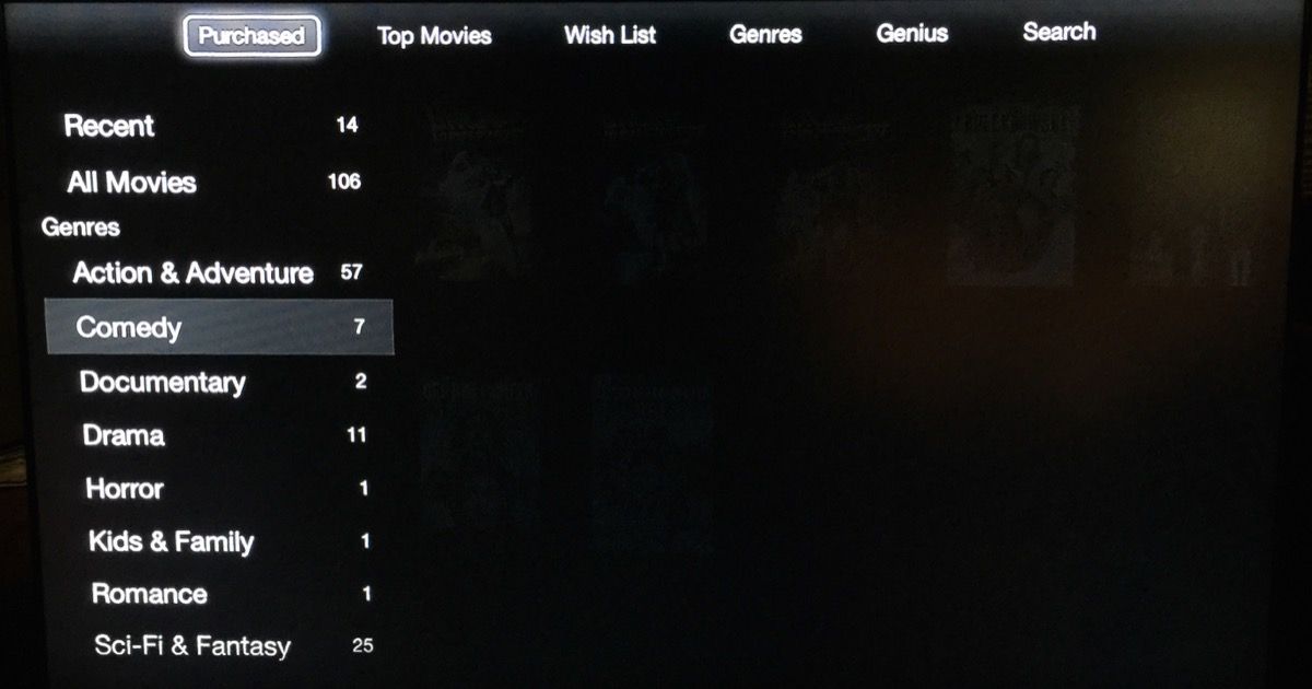
For a second, I get scared. Every time. And I use this screen often. Why am I scared? I don't see any loading indicator. There's no indication of activity. In the span of seconds, scary questions race through my head. Where are my movies? Are they lost? Deleted? Hijacked?
Then, after my heart stops racing, the movies I own suddenly and unceremoniously pop into place.
Man, that's jarring.
Contrast this with playing a movie. After clicking "play" on the Apple remote, I see a nice indicator that Back to the Future is getting ready to play.
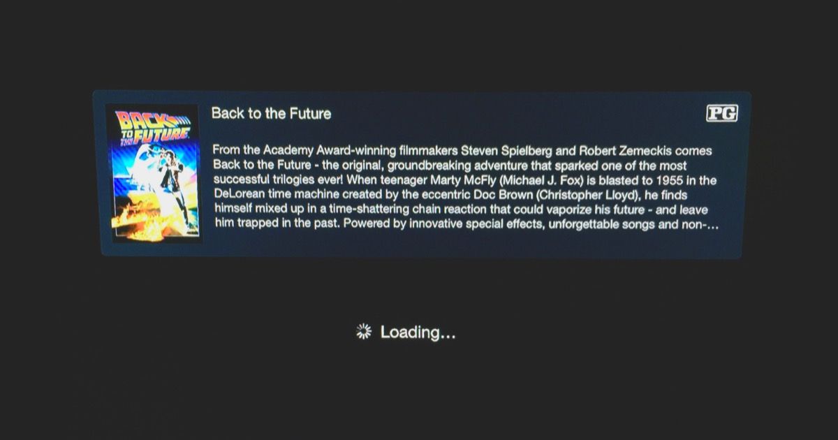
Notice the experiential difference?
Creating interfaces that are easily understood by humans puts us product designers right up against the sad fact that computers are lazy. They don't care about helping people understand what's new, what to do next, or how to react when something goes wrong.
In a computer's ideal world, all they'd have to do is throw obscure error codes and scary-sounding alerts when something unexpected happens. Or, better yet, they'd just talk with you in binary.
But we don't speak binary. We think in flows, and we're used to the physical world. When a door opens, it swings on an arc. When something travels, you can see it move. When something falls, you can see it bounce.
Awkward UI is when a product designer doesn't take these things into account. That means that somewhere along the line, some rules have been broken.
But which rules?
The rules of the UI Stack. Let's talk about that now.
The UI Stack
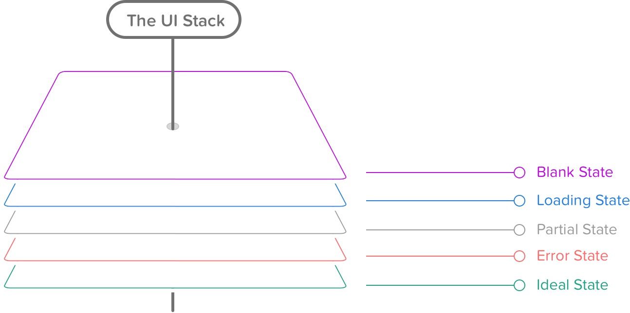
Every screen you interact with in a digital product has multiple personalities.
Five, to be exact.
Depending on the context, these personalities are revealed to your customer. In designer-speak, we call these states. And you should consider these states for every screen you make.
That's because following the rules of the UI Stack and the five states helps you create a cohesive interface that’s forgiving, helpful, and human.
Be honest with yourself. When's the last time you created a screen that had only one state? Even if you're creating weather apps (cue Dribbble joke), one state won't cut it.
The reality is that the world in which we live isn’t perfect, and things go wrong. Servers take time to respond. And your customers won’t always use your product the way in which you intended.
So, as a product designer, you’ve got to take these realities into account.
That’s why every screen you’ll design for your product can have up to five states (click on any to skip to the section):
As your customer moves through your product's flows, they're also going to move seamlessly between between each state within those flows.
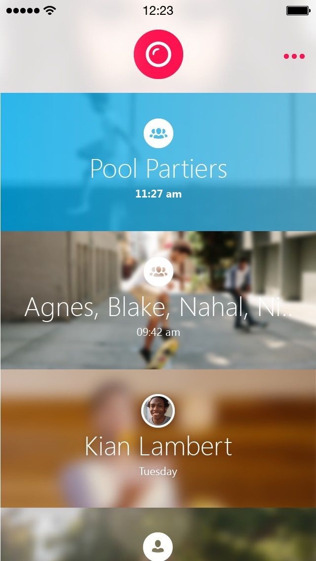
A real-life UI Stack for a messaging app. Each screen transitions seamlessly between each other.
Want to see the UI Stack in action? You can skip there now if you want.
Skip to the UI Stack prototypes
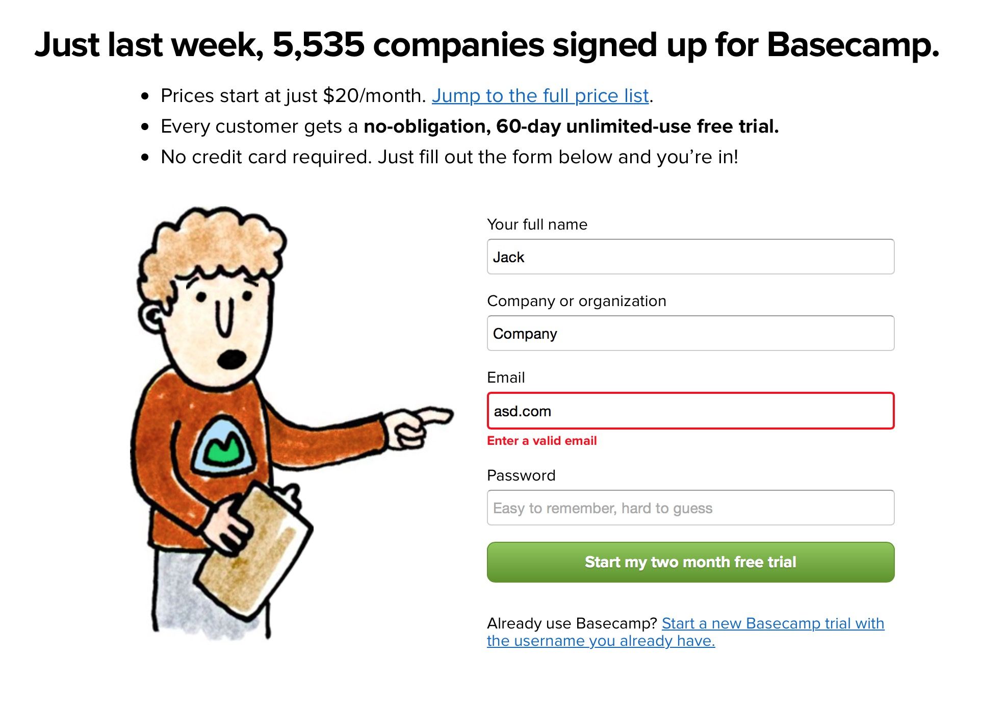
Surprise! It's time for a brief interlude in Internet history. Back in 2004, Basecamp, the company-formerly-known-as-37signals, wrote, for me, a groundbreaking piece entitled "The Three State Solution." (And no, this isn't a plan to end the Israeli-Palestinian conflict). They outlined that every screen should consider three possible states: "regular, blank, and error." This blew my mind. And changed how I thought about design for the web forever.
But things change on the Internet. First, there was the AJAX revolution, second, there came mobile apps. Third came the mass consumerization of technology. Demands and expectations for UIs changed. This is my adaptation of that decade+ idea.
With that noted, let's talk about the Ideal State.
Ideal State
This is the first state I create, since it’s what you want people to see most often. Aptly named, it embodies the zenith of your product’s potential — when your product is providing maximum value and is full of useful, actionable content. It’ll serve as the foundation for every other state you’ll create for this screen. Think of this as the quintessential marketing page or mobile app store screenshot.
Let this state set the tone of each of the other states. Because as you iterate on your core interface, this UI could change completely over time. That’s both the beauty and the risk of iteration.
And this has vast consequences for all of the other states.
All UI states lead to the Ideal State. So start with this first, and let all of the other states fall into place as your designs get closer to solving your customer’s problem.
Still not sure what I mean by the Ideal State? Let’s take a look at some examples to clarify.
Ah, how picturesque. So data. Much photos.

Tinder has one of the best ideal states on the market.
Empty State
An empty state really is bigger than just one screen. It’s about providing your customer an incredible first impression as you introduce them to your product — to spur them to action, keep them interested, and remind them of the value your product’s going to provide.
There are three broad versions of the empty state. The first is what’s seen by your customer the first time they use your product. The second is what’s seen when your customer voluntarily clears existing data from the screen, like when you attain the exalted “Inbox Zero,” for example. And the third is what happens when there isn’t anything to show, say, for a search result.
Broadly speaking, the risk with empty states is that it’s easy to tack them on as an afterthought. Most of the time, doing this either creates an overwhelming experience or a cold, impersonal one.
As George Takei would say: “Oh, my…”
Coach marks — or instructional overlays — are, in my opinion, the best examples of an under-thought first-time experience. They place the burden of learning on the customer that includes more interface, more memorization, all done with a pretty big mental interruption. What a buzzkill.
Let’s explore the first-time use state more in depth below.
First-time use / Onboarding
If a customer is using your product for the first time, this state is your one shot to describe what your customer will see when data exists. It’s your opportunity to encourage action, to help them understand the value they’re going to get out of this screen. First impressions only happen once, and this is your chance to make a great one.
I liken this state partially to what’s known in the literary world as the “Hero’s Journey.” Introduced by Joseph Campbell in his amazing work Hero With a Thousand Faces, it’s the foundation of mythological stories found throughout the world from The Odyssey to Star Wars. Here’s the basic premise:
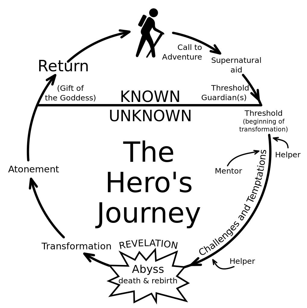
“A hero ventures forth from the world of common day into a region of supernatural wonder: fabulous forces are there encountered and a decisive victory is won: the hero comes back from this mysterious adventure with the power to bestow boons on his fellow man.”

Propel your customer down the hero's journey with the Empty State. Call them to adventure, take them through known challenges and the temptations of the abyss, and transform them into a more powerful individual.
But how? Some ideas:
- Lead a horse to water. Be encouraging and uplifting in your copywriting, and speak plainly about what to do. For example, saying things like “Nothing to see here” really says nothing about what your customer should expect, and it’s a bit depressing that this would be the first thing you’d see. Instead, telling your customer the exact button to press and why they should press it is a much more helpful prospect.
- Use your product’s content to instruct your customer about what to do. For example, if you’re building a messaging product, your first-time experience might automatically include a message in the customer’s inbox. The subject line could say “tap to open me,” while the text within the message discusses more about how to manipulate and reply to a message.
- Offer an example screenshot of what the screen will look like in the ideal state. It brings a bit of hope to your customer that they’ll achieve something similar while showing off how potentially useful your product can be.
- Monitor your customer’s progress and respond accordingly. If they pause too long on a certain screen, for example, you could message them with a live chat asking if they need help.
Here are a few first-time use empty states that I love.

Hipchat comes right out and tells you what to do while hinting at some fun, extra functionality that’s hidden beneath the surface.
Facebook Paper gradually introduces you to its functionality while teaching you key gestures.

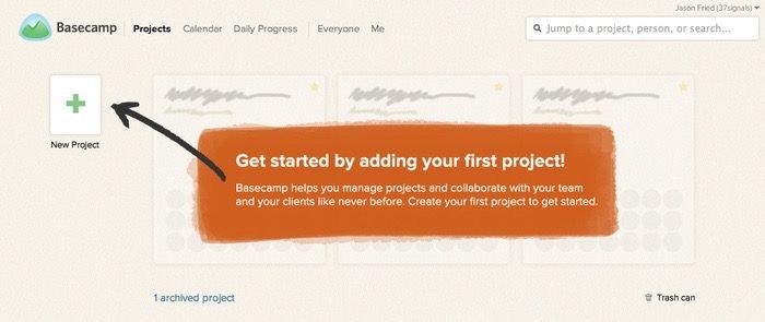
Basecamp has no content to show you — but instead of filling the screen with nothing, it places stand-in content for you to visualize the product’s potential. The completionist in me wants to create projects so I can see this screen full of utopian productivity.

Tapping into Airbnb’s Wish List for the first time gives you this stylishly simple empty state. What I love about this design is that it doesn’t try too hard (fitting with Airbnb’s design language), but also has a very clear call-to-action to get you to start gathering data.
The subject of on boarding and first-time states is a topic big enough for another book. And it just so happens that one exists. If you want to jump into the user on boarding pool, I highly recommend Samuel Hulick’s excellent The Elements of User Onboarding.
User-cleared data
The second type of empty state is the case where your customer has voluntarily removed data from the screen. An example of this would be if your customer completed all of the items on their to-do list, read all of their notifications, archived all of their emails, or finished downloading all of their music.
These types of empty states are great opportunities to reward your customers or to spur further action. Achieved “Inbox Zero?” Great! View this amazing photo. Downloaded all of your music? Good, now go listen to it. Sifted through all of your notifications? Here’s something else you might want to read.
A customer clearing data is a customer who’s engaged with your product. Keep them in the flows your product has in place by doing the work for them. Don’t put the onus on your customer to make the next leap.

A vintage screenshot from iOS 6, yes, but one that still illustrates the slight dopamine drip that comes with achieving Inbox Zero. Your reward is a hand-selected Instagram scene from somebody’s coffee shop or sunset — and you can share it out onto the Interwebz, where you’ll celebrate your Inbox Zero and also advertise for Mailbox. Triple win!
No results
In cases where your customers are browsing or searching for a piece of data in your product, there’s a chance that they won’t find what they’re looking for. These scenarios are amazing opportunities to infer what your customer intended to find and to make intelligent suggestions.
Amazon employs one of the best examples I’ve seen of this technique. Accounting for misspellings and similar searches, Amazon’s search rarely gives you an empty result. Instead, it’ll give you the closest matching result while showing which terms it didn’t match.
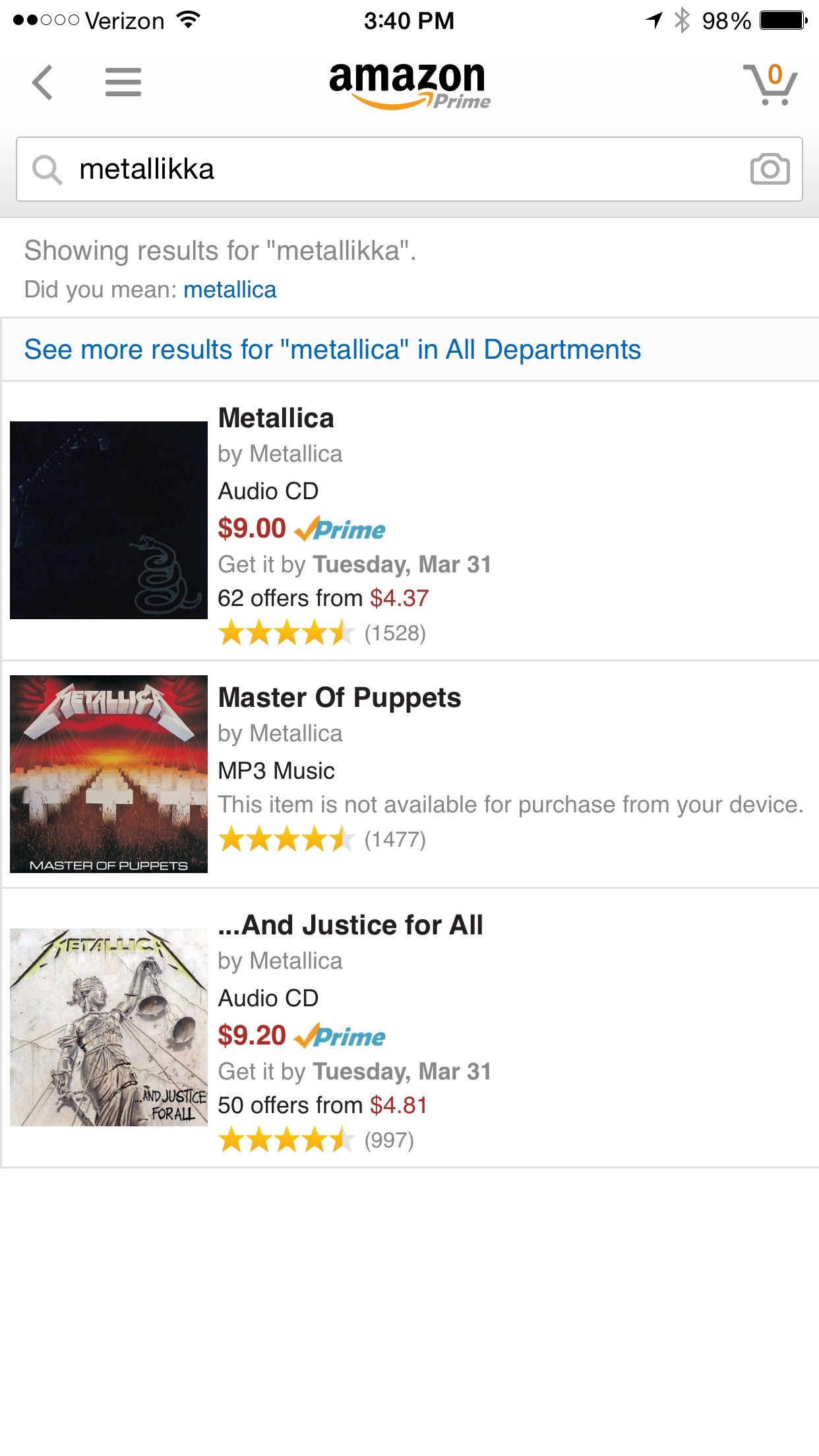
The example where I finally reveal my love for metal. Oh, well, it had to come out sometime.

As for Pinterest, well, not quite the same results as Amazon, but this is Pinterest, after all. Based upon how their search parsed my query, it should be relatively easy for a customer to adjust their search terms to get what they want.

The lesson: don’t just drive your customer off a wall in this state. Give them something they might be able to work with or suggest an alternate path.
Error State
The screen when things go wrong. Typically, this is more complex than just one screen, since errors can occur in surprising combinations. Error states can include anything from form data that’s missing or invalid; an inability for your app to connect to the server; trying to move forward to the next step without finishing an upload, leaving a page without text submitted, and more.
Error states should also be comforting in the sense that your product keeps all user input safe. Your product shouldn’t undo, destroy, or delete anything entered or uploaded by your customer in the event of an error.
It’s apt to paraphrase Jef Raskin, creator of the original Macintosh and author of The Humane Interface. He writes:
“The system should treat all user input as sacred and — to paraphrase Asimov’s first law of robotics, ‘A robot shall not harm a human, or, through inaction, allow a human to come to harm.’ The first law of interface design should be: A computer shall not harm your work or, through inaction, allow your work to come to harm.”
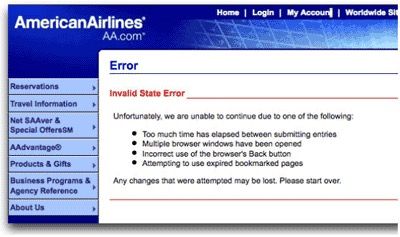
This advice could be well-heeded by some particularly vile offenders of this rule: airline websites. Missing a tiny form field for a credit card security code, for example, frequently results in a page reload that blows away all of your meticulously-entered details while highlighting the missed field with an offensive red hue.
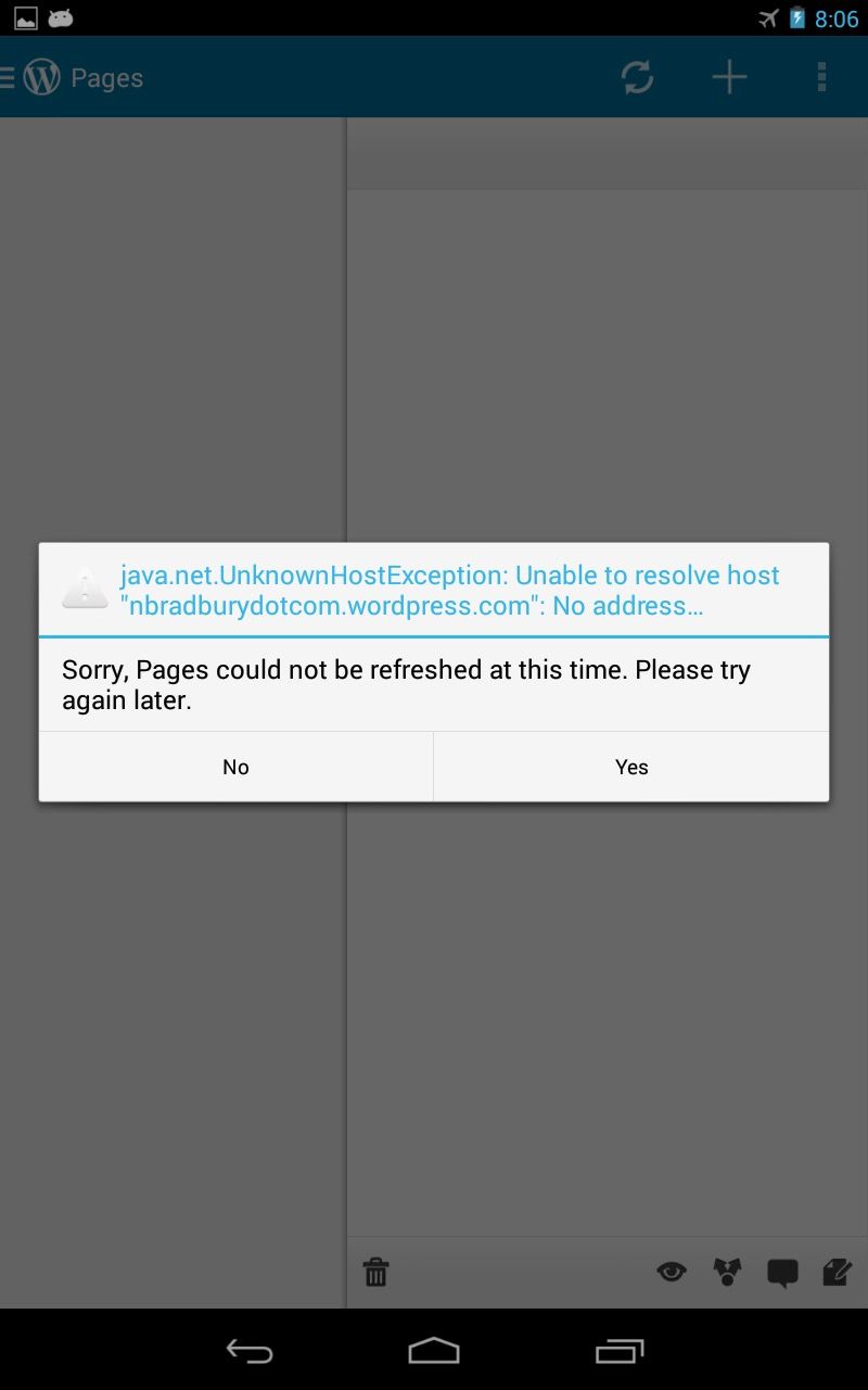

So long, and thanks for all the fish.

No! Yes! Maybe? 
Ah, finally, a contextual error message we can follow. Bonus: we get a little sense of humor to humanize it.
Ideal error states occur dynamically without destroying any data input by the user. If a page reload must occur to detect an error, please do everyone a favor and save whatever data — however flawed — was input into your product. Typically, though, page reloads to detect an error is a sign of laziness. For the sake of your customers, ensure you and your developers go the extra mile to handle errors in graceful and accommodating ways.
Additionally, error states shouldn’t be dramatic, nor should they be vague. Remember the “Blue Screen of Death?” The Mac’s “Kernel Panic?” Or — for those computing veterans — “Abort, Retry, Fail?” Each of these error states, by necessity, mark a significant system error requiring a computer reboot or retry. But to this day, each of these error states are well-remembered because of the shock, fear, and confusion each of them conveyed to the end user.
 Microsoft’s Blue Screen of Death became so infamous because it simply freaked people out. The blue screen — while better than a red one — was out of context, abrupt, and filled with scary-sounding jargon, even if it was useful in debugging the problem.
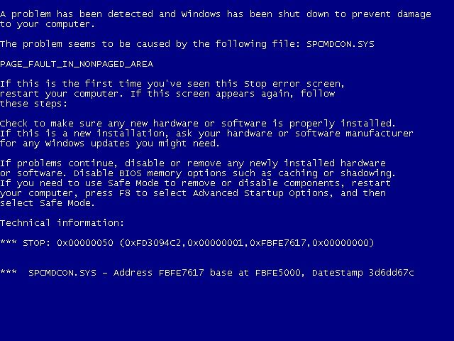
That’s because error states must incorporate concise, friendly, and instructive copy as to what to do next. Vague error codes, hexadecimal numbers and confusing advancement options are only going to scare and frustrate the people who experience these errors.
Of course, your product’s audience might consist of rocket scientists or computer engineers. Then these highly-technical error messages may be well-suited to your customer. But as most of the world adopts software in their everyday lives, these types of error messages become less and less appropriate.
It's simple. Make error messages human, not technical, and suited to your audience. What would you want to be told when something goes wrong?
The error state is such a widespread occurrence, and one of the least-desirable states for which to design. But I promise that if you put as much care into this state as you do into the previous two states, your product will be infinitely more joyful to use — and, more helpful, as you’ll have thought through common customer pitfalls and solved them in advance.
Partial State
The difference between an error state and an ideal state is like night and day. But how does the screen look when there’s only one row of data? A few photos? A half-completed profile?
The partial state is the screen someone will see when the page is no longer empty and sparsely populated. Your job here is to prevent people from getting discouraged and giving up on your product.
This is a great opportunity to design micro interactions to guide people towards the full glory of the Ideal State. It’s a journey on which you take your customers to help them realize the true value of your product. This implies an accomplishment — that your customer has spent some time in your product to see a glimpse of its potential. Keep them hooked.
Some game design principles can be useful here. I’m not referring to the scourge-like practice of making your customers gather crystals to advance a la Clash of Clans, but instead building what is called acceleration into this state of your product.
It’s a game design term that helps a player visualize how they’ll be more powerful in the future, guiding them along a predefined series of tasks to complete to achieve this vision. The trick is to make the player not realize they’re performing what could be perceived as tedium in order to extract the maximum value from your product.
“Players entering an acceleration phase aren’t thinking about the tedious repetitions they have to perform in order to level up, they’re just doing them, and enjoying the accelerating rate of the results…Rather, those players are caught up in a future in which their character(s) will be powerful in a way they can’t even understand yet. To put it more technically, they’re inferring an exponentially increasing power structure that vanishes beyond their player prediction horizon. It’s not exactly the same as traditional flow, but the exhilaration of the players is subjectively very similar.”
Here are some great examples of the Partial State in the wild…
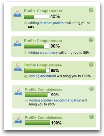
 LinkedIn’s famous “Profile Completeness” bar, encouraging you to perform exact tasks to achieve 100%. Completionists cheer.
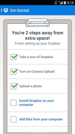
 _Dropbox shows you how close you are to achieving some extra storage space, which is a major attractor for most Dropbox customers, I’m sure. Not only does Dropbox show you how many steps you have left to complete, but these steps also have the side effect of making customers more valuable through education and activation._
Loading State
It’s easy to overlook this state, and many product designers insert it as an afterthought. But there’s a very real burden that comes with setting expectations. When your app is loading data, waiting for an Internet connection, or transitioning to another screen, you must take great care to be mindful of how you represent situations where you’re fetching data. This can consist of an entire page takeover, lazy loading of content panes, or inline loading, potentially used when one might look up username availability from a form field.
And the perception of loading is equally as important. Too often designers simply fill their screens with whitespace and spinners, placing a massive burden of responsibility on the content that isn’t there. This, in turn, encourages your customers to figuratively watch the clock — putting the focus on the indication of progress versus actual loading progress being made.
Such is the belief of Luke Wroblewski, a product design expert that’s led design teams from eBay to Yahoo! to Google, where he now resides after selling his mobile polling startup Polar.
Wroblewski and his team discovered that after implementing a series of loading spinners for each poll, Polar customers began complaining that the app seemed slower, saying things like “There seems to be an excessive amount of waiting around for pages to refresh and load — it doesn’t seem as quick as the previous version.”
Wroblewski realized that:
“With the introduction of these progress indicators, we had made people watch the clock,” he said. “As a result, time went slower and so did our app. We focused on the indicator and not the progress, that is making it clear you are advancing toward your goal not just waiting around.”
Skeleton Screens
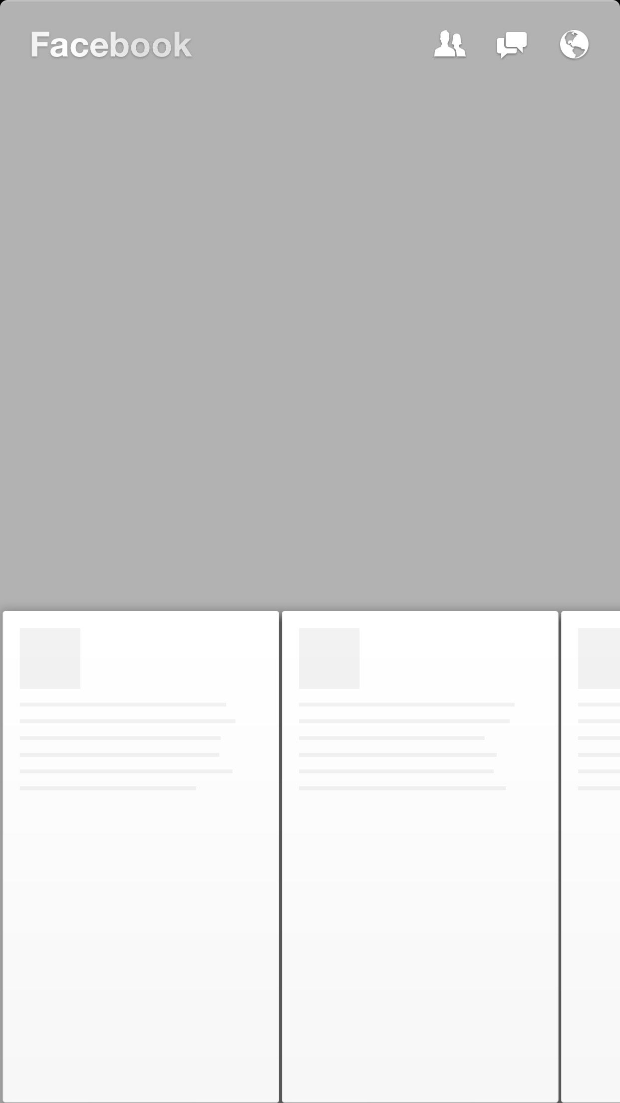
This realization directly resulted in the creation of what he calls “Skeleton Screens.” It’s a technique now being used by Pinterest and Facebook in both their web and mobile versions.
Skeleton Screens are an innovative take on the loading state — it places the focus on the content as it loads versus the fact that the content is loading. This is accomplished by displaying the basic structure of the page and gradually filling in the missing pieces as they download. The beautiful thing about this technique is that it can eliminate spinners completely. And it can increase the perceived performance of your product.
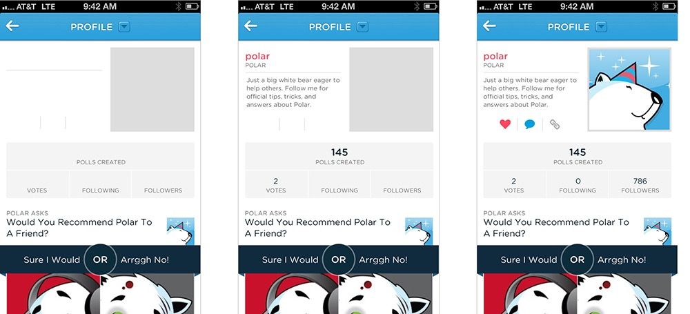

Luke Wroblewski’s app, Polar, and its skeleton loading screens.
Pinterest, while employing the use of the Skeleton Screen loading state concept, put a unique twist on its implementation: deriving the “average color” of the pin’s image and using that color to fill in the pin’s background. So before the pin’s image loads, you feel like you get a preview of what the pin will be.

Facebook invented a similar technique used in their mobile app Paper and later implemented it into their web version. Combined with what they call the “shimmer effect,” the Facebook experience will display a stylized Skeleton Screen with shapes resembling content. And to communicate that the content is loading, the shapes will pulse with a shimmering effect.
Assuming success with optimistic actions
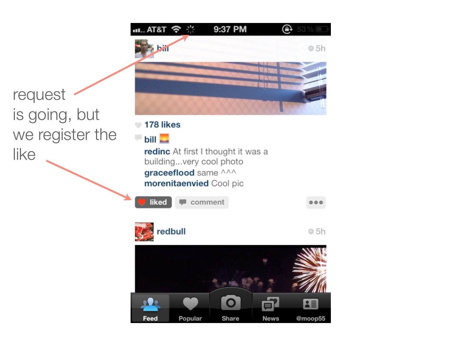
“Nobody wants to wait while they wait,” said Instagram co-founder Mike Krieger in 2011 as he described how his engineering efforts achieved the app’s perceived speed.
Krieger, in fact, pioneered the notion that actions should be performed “optimistically” by a product. By assuming an action’s success, actions appear to take place much faster.
Take the case of “liking” a photo or leaving a comment. In both cases, the action is registered as completed instantly from the perspective of the customer. And in the background, the product is making server requests to actually complete the action. 
Optimistic actions can also greatly help to reduce the perceived speed of uploading media. Instead of uploading when a user taps “Done” at the end of the photo upload flow, Instagram starts uploading the photo immediately after a filter is selected. While it’s not an optimal engineering solution — and data might get thrown out if your customer backtracks — it makes uploads appear to happen very quickly. Following the “move bits when no one’s watching” mantra can help make your product’s speed one of your assets.
You've seen a number of examples of the UI Stack and its five states in isolation. But how would they work together? How does the UI account for the transitions between each state?
That's the power of the UI Stack. These states don't exist in vacuums. They exist on a vertical axis that can be called at any time by the product. It's your job not only to account for each of these states, but to dictate how the screen moves between each state.
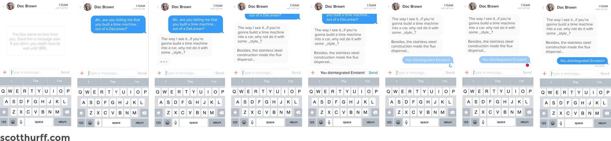
I've created a hypothetical messaging app to illustrate these ideas.
Why a messaging app? Because it's not an immediately obvious example of these states at play. But I think it's a great example of how even temporal UIs like messaging interfaces follow the rules of the UI Stack. And, even further, it's an illustration of how immense our responsibility is to ensure that each screen's states flow smoothly from one to another.
So what do we have to deal with in a messaging app?
We have to account for when there's no messages. This is our blank state.
Our partial state is when only one party has sent a message.
Then, there's receiving a message — the typing indicator. This, in other words, is our loading state.
But wait. There's another series of loading states — when we send a message out. And then there's the delivery confirmation.
An error can happen along the line, too. That's when our message fails to send.
And you can't forget the mechanism by which we recover from an error, and attempt to send again. There's another version of the loading state.
Finally, we reach our ideal state: when messages turn into a conversation.
A hypothetical example
Let's say Marty and Doc just exchange numbers and Marty wants to message Doc about what he's just seen at Twin Pines Mall.
Since there are no messages, we have an opportunity to exploit the empty state and encourage the customer into acting how we want them to act — in this case, that's sending a message.
But what happens to this state when a message is sent? We need to gracefully wash away the empty state and shift it into a partial state: in this case, that's when Marty sends only one message.
Let's fast forward to when Doc has responded. He's sent one message — but he's not done yet! Hence the typing indicator, another form of a loading state.
Once the typing is done and the message is sent, we transition out of the typing indicator and bring in the new message, pushing the others out of the way.
But what about when Marty wants to reply back? First, we have to show some state awareness when there is text in the field — notice how the "Send" button turns from grey (a disabled state) to blue (an enabled state). Then, once we send the message, another loading state occurs for our send process. We keep the message dimmed during this time because there's not a successful delivery yet — until the "delivered" stamp tells the customer that all is well.
But what happens if the message isn't successfully delivered? Here comes our error state. The red marker replaces the loading spinner, and we're left with a message in the "undelivered" dimmed state. Tapping (or, in this case, clicking into the Quartz Composer prototype) on the undelivered message retries the send. We're in luck this time, and the message fills in after the angry red "!" disappears and we can register a delivered indicator.
Here, in the real world...
And that, my friends, is the UI Stack in action. It's the five screen states and the seamless transitions between them. Without these transitionary elements, we risk confusing or surprising our customers as new states appear and disappear. Making people uncomfortable and confused isn't exactly in our job description, now, is it?
In the end, the implementation of these states requires an intense collaboration between design and development. Invest time in each of them — they all work together to create the best, most holistic experience for your customer.
(If you liked anything in this post, I'd be grateful if you shared. Just one click to Tweet (can edit before you send).)
A plot summary of the stunning tale you just read
- Don’t get stuck designing only for your Ideal State and tacking on the other states. Your product solves a problem. How can each screen’s state handhold your customer to that goal?
- Read Samuel Hulick’s The Elements of User Onboarding.
- Make your loading states a part of your prototyping efforts. They’re a part of your product’s experience and shouldn’t be tacked on last. Huddle with engineering to figure out ways to make perceived — and, if possible actual — performance better.
- Spend time thinking through edge cases that can trigger errors. How will you handle them? What’s the friendliest response you can give your customer? There is a cost / benefit tradeoff here, but at least cover the most painful errors and go to great efforts to preserve your customers’ data.