Facebook's release of Paper yesterday on the App Store breaks a string of uninspired releases outside of Instagram, and has many believing it's a glimpse into the future of mobile interaction.
But there's one problem: if this is the future, it's going to hurt. And I mean physically.
There's no doubt that Paper is a fresh and innovative take on content browsing. But while Paper may not ask much of us when we sign up to use the app — it asks a lot of us when it comes to the app's default interactions. So much so that the Paper's heaviest users might need to start popping arthritis medication in a few years.
NAVIGATING WITH THE THUMB HOOK
Paper's biggest problem is one if its nicest features: the physics-driven, inertial carousel at the bottom of the screen. It's an immensely important beginning to the primary goal of getting a user reading stories they like.But take a closer look. Here's what a right-handed user has to do to navigate through Paper's story list:
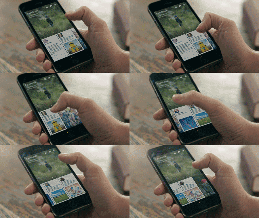
This means that for the ~90% of right-handed phone users, the default thumb position is a hook. Try performing the thumb hook 10, 20, or 30 times in a row. Now try it faster.
Ow.
I don't know about you, but I try and prevent my thumb from making contortions like that. Paper, though, asks us to repeat this gesture quite often if you're using the app with one hand. It's the only way to get to a story you find worth reading.
Many people won't think twice about this. Maybe they've gotten used to their thumbs being twisted into all kinds of pretzels by all the Flappy Birds / Angry Birds / Mailboxes of the world. But this is a significant development. It breaks the basic rule of the Thumb Zone.
THE "THUMB ZONE"
Coined by Steven Hoober, author of the O'Reilly book *Designing Mobile Interfaces*, the Thumb Zone is "the most comfortable area for touch with one-handed use." And while there are many variables at play here, [he found that 49% of users held their phone in one hand and used their phone with one thumb](http://www.uxmatters.com/mt/archives/2013/02/how-do-users-really-hold-mobile-devices.php?).Let's get specific. Paper was released only on iPhone. So let's look at the Thumb Zone on a 4 inch iPhone screen:
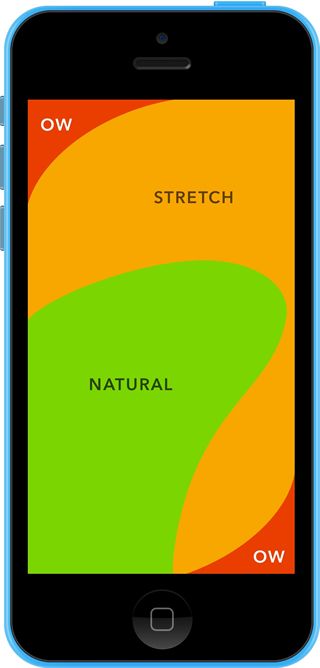
This is definitely a problem I face with apps. The "Ow" Zone at the top of the phone requires me to "choke up" like a baseball bat to tap it; on the other hand, the "Ow" Zone at the lower right of the screen forces me to hook my thumb or shift the lateral position of my phone to comfortably tap it.
PAPER AND THE "THUMB ZONE"
Now, let's look at Paper with overlaid Thumb Zones. Here, you're seeing the same problem within the onboarding step (choosing Topics) and the primary navigation (Topic to Read Story flow).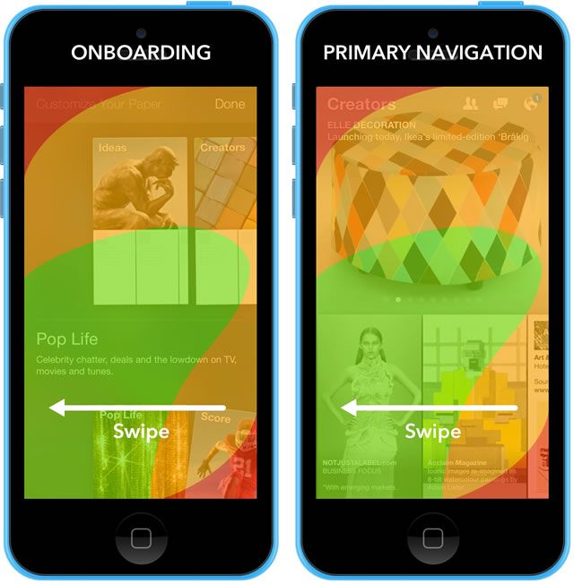
On paper (argh, no pun intended), it looks like all's well. We've got most of the navigational controls covered by green. (Cue "light is green, trap is clean" reference). We're good, right?
Nope.
If I'm a typical, bored user waiting in line for delicious burritos or coffee, I want to maximize my swipes / flicks and see as many stories as I can, as quickly as I can. To accomplish this, I start my thumb from the right of the phone and flick quickly to the left. This means that I have to hook my thumb and jump into the red "Ow" Zone.
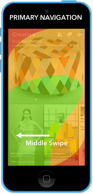
I could stay in the green zone, though, while preventing the Thumb Hook by swiping from the middle. But this isn't ideal. A middle-to-left swipe on the phone doesn't make use of Paper's exciting physics-driven carousel. I can barely get any inertia swiping from the middle. Even worse, my thumb covers up most of the content and I have to make a "dabbing" motion to see a steady stream of stories.
FIXING THE THUMB HOOK
It's fascinating how easy it is to solve this problem. The only realization it requires is that swipes don't have to occur on a strict X or Y axis; they can follow the natural arc of our fingers.Let's take a look at how I'd do it:
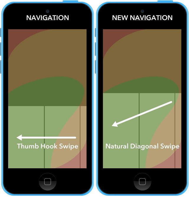
All it requires is shrinking the space allocated to the Topic section above, and increasing the space allocated to the story navigation by 50 pixels. I think this actually supports the mission of the app even more — to push you to read stories you find interesting. By a simple change of 50 pixels, we achieve a number of positive benefits.
First, we eliminate the Thumb Hook and make it more natural to navigate stories with our thumbs.
Second, we increase the space allocated to browsing stories, thus increasing the prominence of this important navigational element to our users.
Third, we increase the space for us to preview story content (photo and text).
FREE: DOWNLOAD MY THUMB ZONE TEMPLATE
The probability that you're building — or will build — a mobile app on iOS is pretty high, so I want to offer you a copy of the Thumb Zone diagram I drew for these screenshots.Download my Thumb Zone template here from Dropbox (Includes a Sketch file and a JPG).
Even though we're each pushing to innovate in the nascent mobile app world, we've still got to remember that natural, comfortable gestures don't change. And while I ragged on Facebook here, it's exciting to see Facebook innovating once again. I'm equally excited to see how the rest of the mobile app industry raises the bar after Paper's release.
Thanks for reading.
[Shout out to Product Hunt, where the spark of this essay originated.]